Insight

How to create an app that’s user-friendly for every generation

Photo of Gemma Oliver

Gemma Oliver

head of operations

5 minutes

time to read

April 22, 2025

published

Imagine this: someone’s grandma downloads your app. Can she sign up, navigate around, and do what she needs to do, without calling in a grandchild or giving up entirely?

If not, there’s a bigger problem than just Grandma’s user experience.

Because if your app leaves one person confused, chances are it's not just her. Poor usability doesn't discriminate, it frustrates everyone. From digitally curious Boomers and distracted Gen Z multitaskers, to users with disabilities or those relying on public libraries for access, no one wants an app that feels like a puzzle.

That’s where digital inclusion comes in. It’s not about dumbing things down, it’s about designing smart, intuitive experiences that everyone can access and enjoy. And that’s what we do best.

Let’s dig into what makes an app truly user-friendly for every generation.


Why great UX means anyone should be able to use your app

We’ve all heard it:

“I clicked something, and now it’s gone!”

Sound familiar?

That’s not a Grandma problem. That’s a UX problem.

Your app shouldn’t need a tutorial - or a teenager - to be usable. It should be so clear and effortless that even someone completely new to tech can pick it up and start using it. No confusion. No second-guessing. Just clarity.

When you get it right, everyone benefits. That’s the power of good design.

teenager showing grandma how to use an app
 

Don’t get fancy, get functional

We’ve seen it before. Apps trying to impress with hidden gestures, swipe-this-way interfaces, or clever animations that end up confusing more than they wow.

It’s like opening a spreadsheet full of complex formulas without any explanation. The person who made it might find it intuitive, but you’re left scratching your head.

So, skip the gimmicks. Focus on what actually works:

  • Use plain language. No jargon, no weird abbreviations.
  • Make key actions obvious. Buttons should look like buttons.
  • Avoid hidden gestures. If you can swipe, say so.
  • Stick to recognisable patterns. Don’t reinvent navigation just to be different.

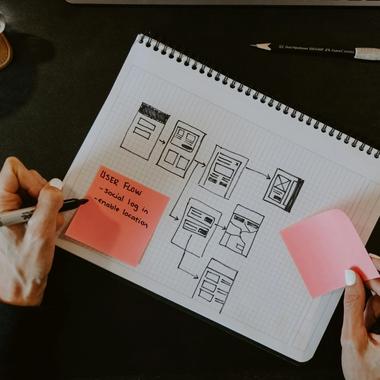
During the discovery phase, this is exactly the kind of stuff we deep-dive into. We consider every user type, every use case, and every possible pain point before a single pixel gets designed.


If you need a manual, you’ve missed the mark

At The Distance, our goal is always to create apps that feel effortless.

Yes, a short onboarding experience can be helpful. But if your user needs a step-by-step guide before they can even use your app, that’s a problem.

Here’s what we focus on to avoid that:

  • No clutter. Too many fields on one screen = overwhelmed users. E.g. a sign-up screen with Name, Email, Password is fine. One with Full Name, DOB, Address, Company, Interests, Star Sign, Favourite Biscuit… isn’t.
  • Consistent design. Buttons shouldn’t play hide and seek. Keep navigation in the same place throughout.
  • Clear feedback. If something’s loading, tell the user. “Processing…” is way more reassuring than silence.

Our UI experts work all this into your app during the design phase, balancing accessibility, brand consistency, and modern UI standards. (Plus, we throw in the fun stuff like slick animations and beautiful iconography.)

If someone opens your app and instantly gets it, you’ve nailed it.

 
error code

Everyone makes mistakes, let them fix them

Great UX isn’t just about guiding users through the right steps. It’s also about giving them a way back when they slip up.

Because let’s face it, mistakes happen. And nothing kills trust like the fear of doing something wrong with no way to undo it.

Here’s what we build in to make sure users feel safe:

  • Undo options. No “Oops, I deleted everything” moments.
  • Friendly error messages. “Oops! That email doesn’t look right” is much better than “Error 404”.
  • Confirmations before major actions. Like deleting an account or making a big purchase.

And we don’t just design the ‘perfect path’ through your app. We design for the what-ifs - error messages, screens with no data, popups, and fallbacks. Because a user who feels in control, even when things go wrong, is a user who sticks around.


Accessibility isn’t optional; it’s essential

Making your app “grandma-proof” isn’t about being patronising. It’s about building something inclusive. Something that doesn’t leave people out.

That means designing for:

  • Users with vision impairments
  • People with motor limitations or cognitive differences
  • Low digital literacy users
  • People with limited data plans or older devices

In other words, everyone.

This is what digital inclusion means: creating experiences that work for all users, regardless of age, ability, or tech know-how.

That’s why we always consider:

  • Text and button size - tiny tap targets are a no-go
  • Colour contrast - legibility matters
  • Audio alternatives - not everyone can hear
  • No time pressure - some people need longer to read and react

We’ve written more on this in our accessibility blog, but the bottom line is: accessibility isn’t a checklist at the end. It’s baked into every decision we make from the start.


If Grandma can use it, you’re winning

The best apps aren’t just powerful, they’re effortless.

So, before launching your app, ask yourself:

Would someone like my grandma feel confident using this? Or more broadly: Am I digitally excluding anyone?

If the answer’s yes, it’s time to simplify. Or better yet, time to work with an agency that makes inclusive design the default.

At The Distance, we believe in building apps that everyone can enjoy. From your gran to your nephew, your CEO to your newest customer - let’s make it effortless.

 
contact us

Apply theses insights

Contact us to discuss how we can apply theses insights to your project