MCard
Enhancing MCard for a better
commuter experience
The Brief
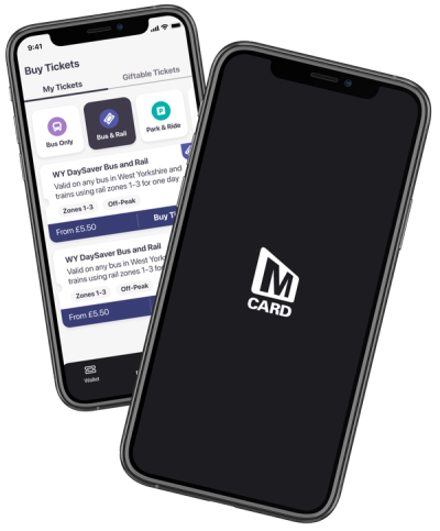
YorCard created an application called MCard. The existing application that they created was to allow users to purchase and manage their bus and rail tickets for anywhere in West Yorkshire. The application was successful, but it was time for a refresh and revamp.
The Problem
The existing version of MCard was built to solve a particular problem. It was built to be able to purchase and manage digital tickets. It was built by developers and functionality was the main focus. This meant that the user experience of the application was lacking.
Customers who were using this version of MCard were crying out for changes to be made to enhance the service. They loved the application, but wanted more from it! YorCard had the technical skills but needed outside help to delve into the user experience and the design.
The Solution
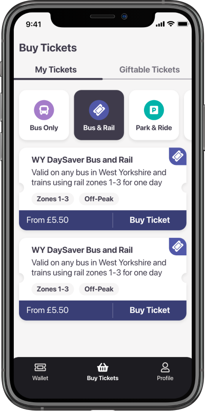
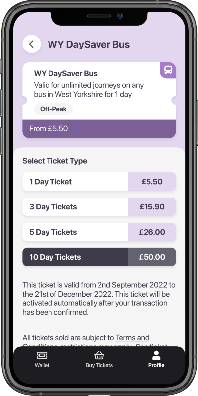
YorCard came to The Distance wanting us to re-design their existing application as well as delve into and improve the user experience. This required us to understand the user's flows, the target audiences and the existing customer's pain points. Once we had an understanding of that, we were able to re-design the application from scratch.
The Distance started by creating a design system that could be used by Yorcards developers. This was crucial for Yorcard to be able to apply the design consistently. The designs went through a few iterations, with the help of some key feedback from both Yorcard and their users. This helped make sure the designs accomplished what Yorcard were trying to achieve.
The Results
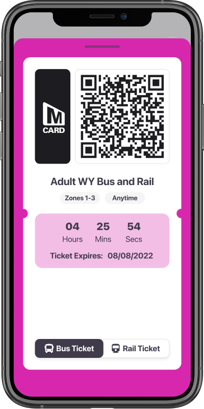
Once the designs were complete, the handover with YorCard was crucial to make sure their developers understood the design and the design system clearly. After the initial handover meeting, The Distance was on hand to advise on any ad hock questions whilst this was in development.
Once developed, The Distance was given a chance to test the application from a design point of view to verify the design was implemented correctly before the application went live.
Due to the incredible partnership between YorCard and The Distance, we even looked at introducing new key features. Rather than looking at it from a purely functional point of view, YorCard understood the importance of the user experience and verified the flows/design before applying the functionality. The application was launched and their users were very happy with the latest version of the app.
Success stories

Industry leading travel companion app, rated 4.7 ★'s from over 7000 reviews

One place for tour management everywhere you go
