Insight

How to balance innovation and usability in app design

How to balance innovation and usability in app design

James Paton

Photo of James Paton

James Paton

head of digital product design

6 minutes

time to read

November 18, 2025

published

App design is a constant balancing act. Push too far into innovation, and you risk confusing users. Stick too closely to familiar patterns, and your product blends into the background. The magic happens in the middle, where standout features meet intuitive, effortless usability.

This balance is something experienced mobile app developers navigate every day. It’s a blend of psychology, design craft, technical skill, brand expression, and restraint. And when it’s done well, it creates apps people love using, not just looking at.

Let’s break down what that balance really looks like, why it matters, and how it shapes the long-term success of a digital product.


 

Innovation vs. usability - Why they pull against each other

Innovation is exciting. It captures attention, establishes identity, and helps apps stand out in a saturated market. But innovation also introduces friction. New patterns take time to understand. Complex ideas need more explanation. Flashy features often demand more from devices and from users.

Usability, on the other hand, is about reducing friction. It’s clarity, predictability, and comfort.

There’s a well-documented principle that explains this tension: the flexibility–usability tradeoff. In short, the more flexible and feature-rich a system is, the harder it becomes to use.


A real world example

To illustrate the balance, take Lando Norris’s website as an example; it’s not an app, but it’s a visually stunning digital playground built by Off+Brand that perfectly shows what happens when creativity takes centre stage over usability.

It’s loaded with energetic interactions, WebGL animations, playful transitions, and an unmistakable identity. It’s bold. It’s memorable. It’s technically impressive.

lando norris website

But it’s also a perfect example of what happens when innovation takes the driver's seat. Users on Reddit have pointed out tricky navigation, heavy animations, and “scroll hijacking,” noting that it prioritises showmanship over simplicity.

For a celebrity brand, that tradeoff makes sense. For most digital products, it’s a watch-out: innovation needs to be purposeful, not just decorative.


So what does balanced app design look like?

Balanced apps introduce new ideas without breaking the flow users already expect. They feel fresh, but still intuitive. They stand out, but still work for real people in real contexts.

Here’s how skilled application developers and product designers usually approach that balance.


Start with User-Centred Intent, not novelty for novelty’s sake

Successful apps start with a deep understanding of their users - what they need, how they think, what frustrates them, and what motivates them. That insight shapes everything else.

Modern UX research backs this up. Mapping user journeys helps identify where innovation supports the experience vs. where it introduces confusion.

Experienced app developers use this lens to decide:

  • Where to introduce new ideas
  • Where to keep things familiar
  • Where to simplify
  • Where to add delight

Without this foundation, even the most beautiful design can feel disjointed.


Build innovation in layers, not all at once

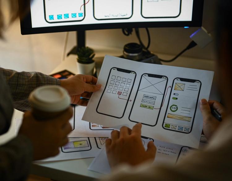
One of the best ways to innovate safely is through iteration. Instead of committing to a fully experimental interface from the outset, skilled teams introduce ideas gradually:

  • Start with a clean, usable foundation
  • Experiment with prototypes
  • Test early with real users
  • Measure what works
  • Add ambitious elements once the UX is stable

A/B testing plays a huge role here. There’s research showing how split-testing UI elements (even something as simple as button placement) can significantly improve performance in apps.

Innovation becomes a measured process, not a gamble.

 
microinteractions

Use microinteractions to add personality without overload

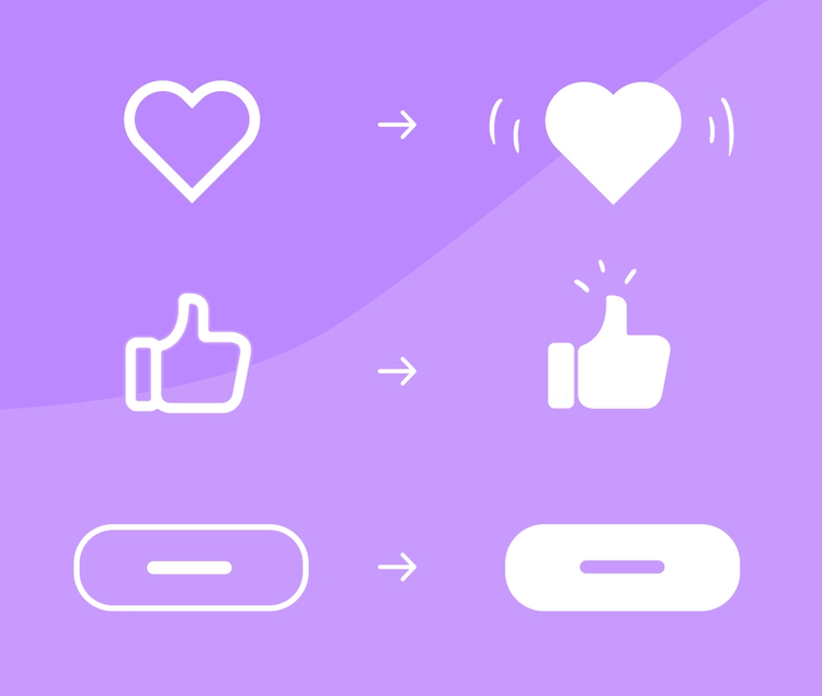
Microinteractions (the tiny animations you barely notice but always feel) are one of the easiest ways to introduce innovation without harming usability.

Examples:

  • A button that ripples when tapped
  • A subtle colour shift guiding your eye
  • A playful loading animation tied to your brand

Studies show that well-executed UI animations can significantly improve engagement and retention.

They enhance the experience, add delight, and build brand identity, all while keeping the core user journey clear and stable.

Image source.


Don’t let innovation compromise performance

Performance is non-negotiable. The more innovative your app becomes (3D graphics, heavy animations, complex logic), the more you risk slowing everything down. And slow apps don’t just annoy users, they lose them.

Research shows that mobile apps with fast loading times see stronger retention and satisfaction overall.

A beautiful experience that lags is still a broken experience. Great application developers know how to push creative boundaries while keeping apps responsive, efficient, and lightweight.


Accessibility isn’t optional, even with innovative design

Accessibility is often the first casualty of overly creative interfaces. Non-standard layouts, experimental gestures, low contrast, or heavy animations can exclude large groups of users.

But accessible design doesn’t mean dull design. It means:

  • Respecting readability
  • Simplifying movement
  • Allowing alternatives for interaction
  • Ensuring clarity in structure

Innovation should invite people in, not lock them out.


Why expert app developers make this balance look easy

Balancing usability and innovation is part art, part science. It demands wide-ranging skills: behavioural psychology, modern design trends, platform constraints, accessibility best practices, performance optimisation, and technical engineering.

Experienced mobile app developers (especially those who’ve built products across multiple industries, like us!) instinctively understand the tradeoffs. They know how far to push. They know when to experiment. They know what will scale and what won’t. And they know how to keep users grounded even when the features are ambitious.

This is why partnering with seasoned app developers in the UK pays off: you’re tapping into a process that protects your product from risk while still giving it space to stand out.


Where teams often go wrong

Some common pitfalls appear across projects:

  • Too much flair, not enough clarity
  • Too many features, not enough focus
  • A great prototype that doesn’t translate to real-world devices
  • Over-reliance on complex animations
  • Ignoring accessibility until too late
  • Innovation added because it’s “cool,” not because it adds value

Avoiding these mistakes is half the battle.

where teams go wrong with design
 

Innovation that feels effortless

At its best, innovation is invisible. Users might not consciously notice your microinteractions, your subtle transitions, your guided flows, or the way you subtly direct attention, but they’ll feel it.

And that’s the point.

Balanced, thoughtful design empowers users. It meets expectations while gently pushing them forward. It introduces moments of delight without requiring extra effort. It makes the app feel modern, premium, and confidently built.

When innovation and usability work together, you get a product that feels both exciting and familiar, which is exactly why people keep coming back to it.

Want to build an app that feels innovative without overwhelming your users? Our team blends creativity with clarity to create digital experiences that truly work.

 
contact us

Apply theses insights

Contact us to discuss how we can apply theses insights to your project